Contrary to appearances, it is not easy to create your logo. Should we opt for the originality card or rather restrict ourselves to the basics? What color to adopt? What will the logo mean in relation to the brand? What target is targeted? These are all questions to ask yourself before you start. Every detail must be thought through and make sense; nothing should be left to chance. Here are eight tips for creating a logo with great potential.
1. Go for Simplicity
A logo must be understood by everyone and reasonably quickly. Simplicity remains a safe bet because the more straightforward a logo, the more it is readable and the more it remains anchored in consumers’ memory. For example, Nike’s comma is an elementary, no-frills logo. It is one of the most famous logos in the world. Despite these simplistic airs, it is not meaningless since the comma is supposed to represent both the movement and the wings of Nike, the Greek goddess of victory. There is therefore consistency between the product and the logo.
2. Use the Right Colors

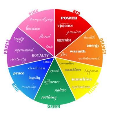
It is advisable not to use more than three colors and to choose one that is more dominant than the others. The marriage of shades is also very important; some colors do not come together, whether in paint or for a logo. In addition to being complementary, these colors must have a meaning vis-à-vis your brand or your products, which will influence the message you want to convey. In any case, this should not be chosen randomly.
3. Use the Right Shapes
The importance of consistency between color and your business or product also applies to form. Some institutions or brands have suffered from this because they have not paid attention to the double meaning that certain forms associated together can create. There are several companies that got in the crossfire by using the wrong elements in their logos.
4. Typography is Vital

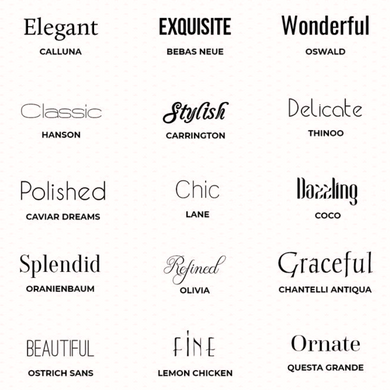
In terms of consistency and aesthetics, it is advisable not to exceed two fonts. One more thing: everyone loves custom typography. The idea of creating your logo involves creating your own typography; this will make your logo even more unique. The example of Coca-Cola illustrates this perfectly since the brand’s typography has been copied many times, which conveys the product’s image twice as much. In the minds of consumers no matter what is written, they will always see the Coca-Cola brand.
5. Avoid Clichéd Logos
Your communication or design agency may have offered you a “trendy” logo, in tune with the times, an image that is readily available on all media and in all countries, even if it is close to the cliché. Beware! Because even if it can be effective at the time, such a logo can be tedious in the long run for the consumer and therefore not go through the ages! So prefer a personalized and unique logo.
6. Logo should Reflect your Business

To be as impactful as possible, it is preferable that your logo recalls your activity. For example, if you work in the automotive spare parts sector, you could opt for an adjustable wrench, a wheel, or a steering wheel as your logo! Of course, if the name of the firm is easy for consumers to memorize, it is sometimes just as striking that the logo repeats this name. This is the case of successful companies like Fila, Coca-Cola, or Google, whose very short names immediately found an impact on the customer.
7. Go for a Timeless Logo
Just remember trends die, and class remains forever. Being original is not necessarily an asset over time. Trends change and your logo should be as timeless as possible and therefore relatively neutral. This will prevent you from making significant changes or destabilizing your customers.
8. Use Creative Elements
There is no harm in having a little fun with your designs. Creating a logo that contains “two images in one” is still a good idea, as long as it’s not too complicated to guess. Be careful that this does not become a torture of the mind: Olins Wolff, the designer of the logo of the London Olympics in 2012, for example, was refused his logo, deemed too complex.
