
Table of Contents
Toggle1. Quiet Luxury and Controlled Minimalism
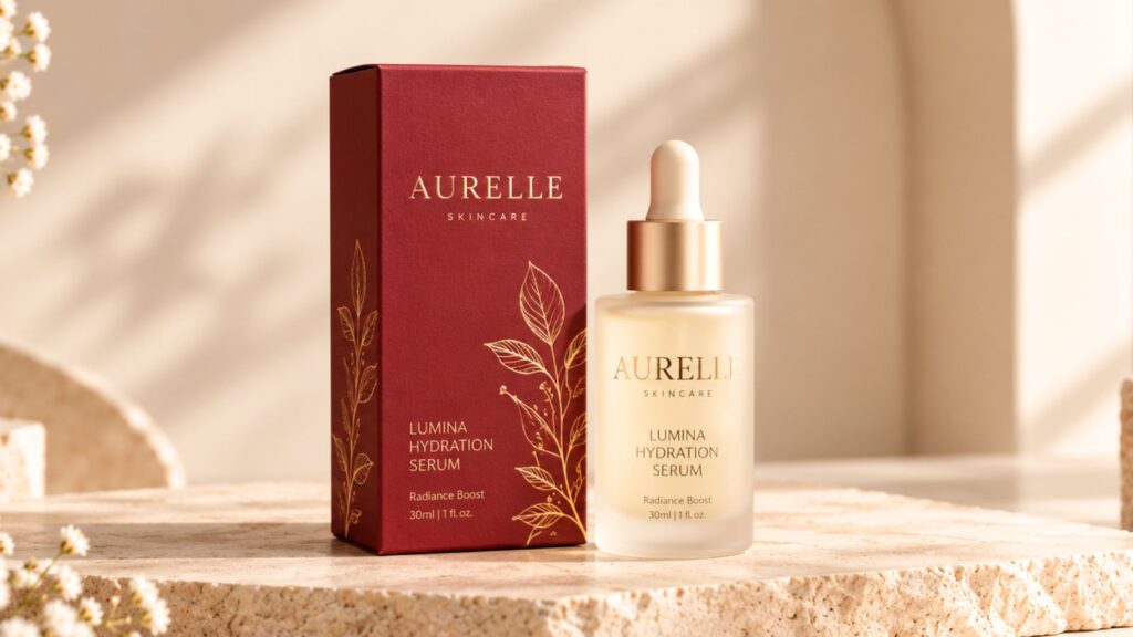
Skincare boxes are getting calmer. A single wordmark, generous blank space, and a restrained colour palette now signal quality more reliably than a fully printed design. Because there is so little on the box, every detail has to be right: the paper, the print registration, and the edge finish all show.
This is also why minimalism costs more to execute than it looks. A busy design can hide small flaws, while a plain ivory box with one line of text cannot.
2. Tactile Finishes Over Glossy Ones
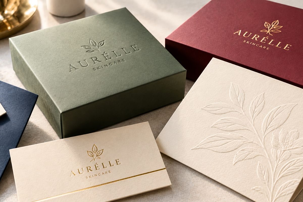
Brands are moving away from high-gloss coatings toward finishes you feel before you read anything. Soft-touch lamination, blind embossing, and debossed logos add texture without adding colour, which suits the quieter look above. A single foil stamped detail, such as a logo or a thin line, then adds contrast against a matte surface.
If you are deciding between finishes, our guides to embossing and debossing and lamination types cover how each one behaves on different board.
3. Rigid and Magnetic Boxes for Hero Products and Gift Sets
Rigid construction has become the default for serums, creams, and gift sets positioned at the premium end. The box holds its shape, protects glass jars and bottles, and feels substantial in hand. A magnetic closure adds a slower, more deliberate opening, which suits products people often buy as gifts around Ramadan, Eid, and the year-end season.
For brands exploring this category more broadly, our luxury packaging range shows the structures available
4. Recyclable Paperboard That Still Looks Premium
Sustainability has moved from a talking point to an expectation. Recyclable paperboard and kraft are now common across natural skincare lines, and the more convincing versions avoid the old assumption that eco means plain brown. A recyclable board with one tactile finish and a tidy layout looks considered rather than basic.
The practical rule is fewer layers. Removing unnecessary plastic windows, films, and fillers makes the box easier to recycle and usually makes the design cleaner as well.
5. Refillable and Reusable Systems
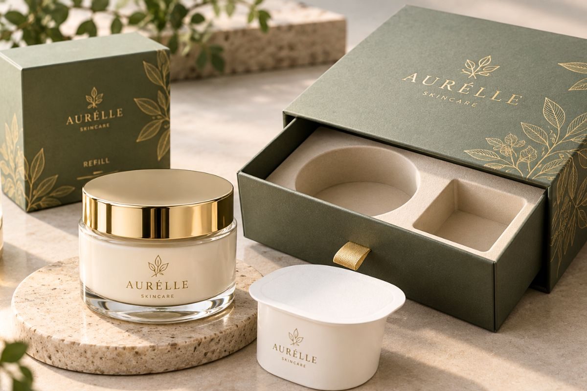
Refill systems have moved from a sustainability extra to an expected option in premium skincare. In packaging terms, this usually means a durable outer container the customer keeps, with lighter refills sold separately. The outer box and jar carry the premium weight and finish, while the refill pack stays simple.
A refillable range raises the standard for the keepsake pieces. A sturdy drawer box or lidded rigid box that customers reuse for storage keeps your branding in their home long after the product is finished.
6. Fitted Interiors and Right-Sized Boxes
The inside of the box now gets as much attention as the outside. Fitted inserts hold each bottle or jar in place, and boxes are sized closer to the product so there is less empty space and less filler. A printed interior or a coloured lining also gives the unboxing a second moment after the lid comes off.
Right-sizing matters for shipping too. A box that fits the product properly needs less padding and is less likely to arrive with a dented corner.
7. Clearer Information and Claim-Aware Design
Shoppers read skincare packaging more closely than they used to, and they notice vague claims. Cleaner typography, readable ingredient lists, and plain disposal or recycling guidance are replacing decorative wording. Any sustainability message on the box should be specific and true, since overstated claims damage trust faster than a plain box does.
This is a design trend and a content trend at once. The layout needs space for useful information without cluttering the quiet look from trend one.